1. About the project
————————————
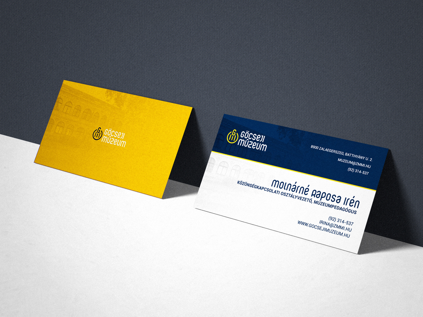
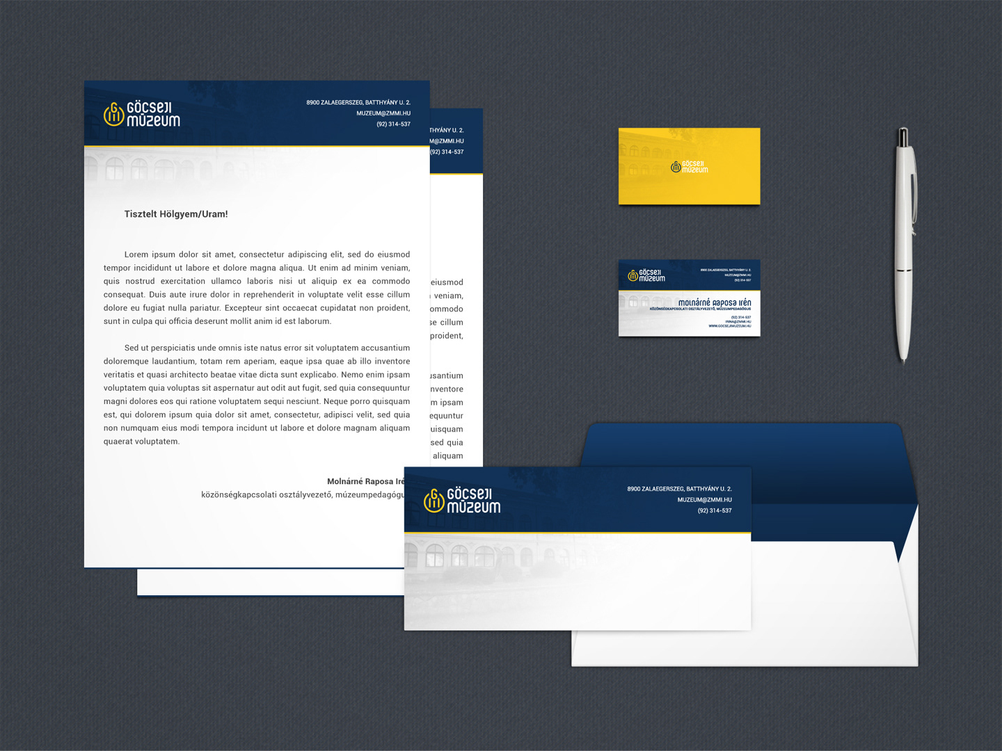
One of the biggest graphic design challenges is to design the identity of an institution, especially if it is a museum with a long history like the Göcseji Museum. Thanks to Pazirik Informatics Ltd., I had the opportunity to redesign the logo of the Zalaegerszeg-based Museum, which is expected to produce an elegant, clean and trendy look. As a graphic designer and as a museologist, it was enjoyable to build my plans after deepening in the history of the museum.
2. The concept
————————
When designing the logo, my primary opinion and purpose was to match the above mentioned words of call (elegant, clean, trendy). On the other hand, it was important that the logo and the identity line (fonts, colors, etc.) can be carry forward to new exhibitions. This idea has been defined by the Göcseji Museum's 70-year-old tradition that could slowly be placed in the line of museums with great traditions. This can be promoted by a classical and forward-looking identity that is memorable and come in useful.


3. The logo
3.1. Form
—————
In my opinion, the circle is one of the simplest, most useful form and logo at the same time. This basic form was placed around the 'GM' monogram; this is the symbol of the emblem. Another highlight of the emblem is the logotype, which displays the full name of the museum with the font used in the symbol. The left-handed type shown here is the vertical version of the logo, the horizontal version can be seen in section 3.4.
The edited image of the logo. My goals with the form of the logo were:
• Simplicity / readability
(circular symbol, matching font)
(circular symbol, matching font)
• Recognizability
(a unique symbol that can remind the semicircular windows of the building)
(a unique symbol that can remind the semicircular windows of the building)
• Harmony
(appropriate positions and distances)
(appropriate positions and distances)
• Versatile usability
3. The logo
3.2. Colors
——————
The colors of my emblem are made up of blue and yellow base colors, which I hope are fits to the above mentioned callers (perhaps mostly 'trendy'). The logo is also available in black and white versions as it may in some cases be used only in this form (e.g. black: fax, stamp), or looks nice in this way (white: on a dark or colored basis).
In today's trends, logos and inscriptions are often used on dark or colored basis in white. Accordingly, I also tried the usability of this and I could imagine the use of this logo. The source file of the logo contains both primary (white on color) and secondary (color on white), or rather black and white versions.
3. The logo
3.3. Typography
—————————
An important part of the design was the research until the appropriate font for the unique symbol idea matched. Present case this was the following:
• Ruler Modern
With the font designed by Levente Szekeres, I could have created a sufficiently strong visual signal. The full font family has more than 500 characters, exciting texts can be created with big and small characters (even for an identity of an exhibition), and I've only replaced the long accents for a more appropriate in the emblem.
3. The logo
3.4. Versions
———————
Vertical/Horizontal:
• Default, color version
• On a color basis, white version
• Default, color version
• On a color basis, white version
4. The identity
————————
